Free Fire Font Style Guide 2026: How to Build a Name That Actually Stands Out
Your Free Fire name is the very first thing anyone sees about you before your rank, before your K/D, before a single bullet is fired. A sharp font style turns a forgettable username into something squadmates remember and random players screenshot. But most guides stop at “here are some cool letters,” without explaining why some fancy names look amazing on your phone and turn into broken boxes the second you enter a match.
This guide covers what a Free Fire font style really is, how to pick one that matches your playstyle, and how to avoid the mistakes that get names rejected or left unreadable in a fast-moving kill feed.
Key Takeaways
- A Free Fire font style isn’t a new typeface it’s a set of Unicode characters that mimic a different font.
- The game’s interface always uses the same fixed system font; only the characters you type change.
- Readability in the kill feed matters more than how flashy a name looks in a generator preview.
- One or two symbols per name reads as intentional; five symbols reads as noise.
- Testing your name in a custom room before locking it in saves you from an unreadable tag later.
What Is a Font Style in Free Fire, Really?
Free Fire doesn’t let you install or select a font. The game engine renders every name, kill feed entry, and lobby list with one fixed system font that part never changes, no matter what settings you dig through.
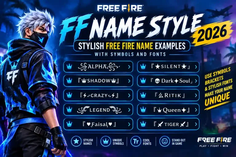
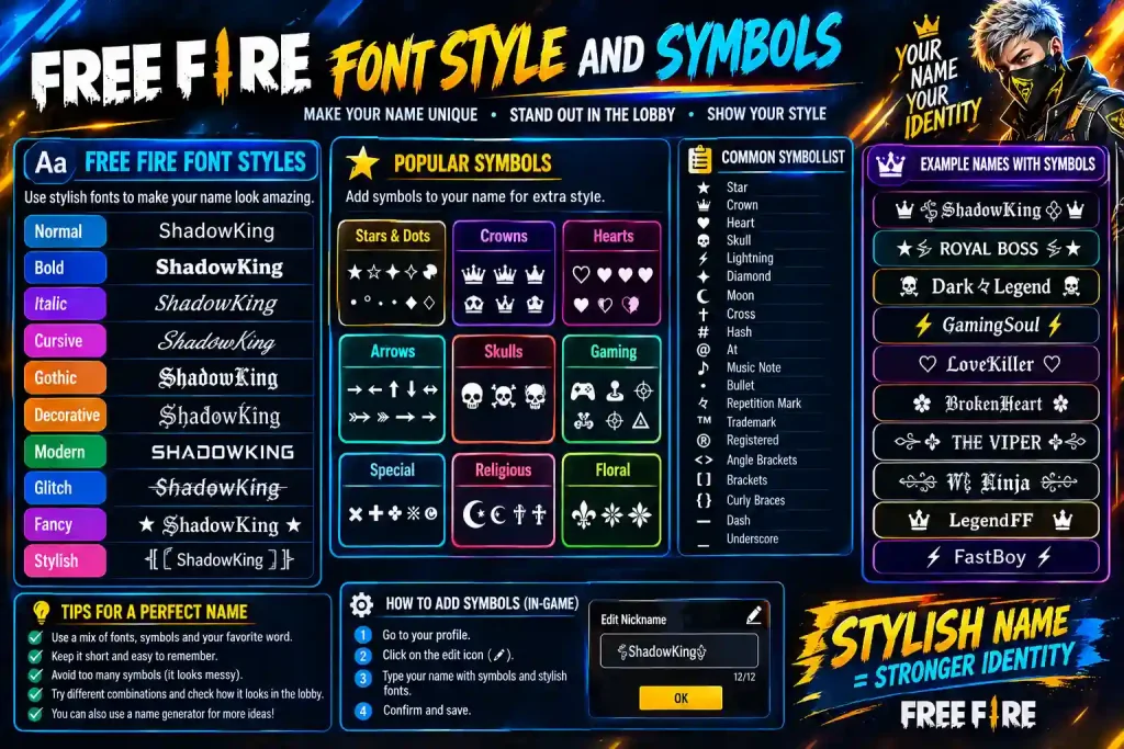
What actually changes is the characters you type. Unicode, the character-encoding standard behind every keyboard, includes thousands of symbols beyond plain A–Z letters bold letters, script letters, circled letters, and decorative symbols like crowns, wings, and stars. A name generator simply swaps your normal letters for Unicode look-alikes, so Raven becomes something like 𝓡𝓪𝓿𝓮𝓷 without touching a single font file.
That’s the whole trick behind every “fancy font” tool online: it’s character substitution, not font installation. Once that clicks, choosing a style stops being confusing you’re really just picking which set of Unicode letters best fits your name.
Why Device Differences Break Some Styles
Because these are Unicode characters and not a real font, how they display depends entirely on the device reading them. A style that looks perfect on a newer Android phone can show up as empty boxes or question marks on an older iPhone or a budget device, simply because that device’s font library doesn’t include glyphs for those particular Unicode blocks.
This is the single biggest reason a name that looked great in a generator preview turns unreadable in-game. Before locking in any style, paste it into a custom room or a private message to a friend on a different device and check that it renders cleanly.
Font Categories: The Vocabulary Worth Knowing
Most generator sites group styles by vibe “cool,” “cute,” “scary” but knowing the real category names helps you describe exactly what you want and spot the right style faster.
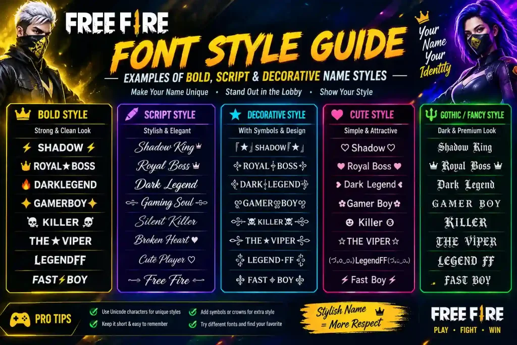
- Serif styles carry small decorative strokes at the end of each letter. They read as classic or formal, well suited to guild or clan-style names.
- Sans-serif styles drop those strokes for a cleaner, modern look, and generally stay the most legible at small kill-feed sizes.
- Script styles imitate handwriting or calligraphy elegant, but often the hardest to read mid-fight.
- Decorative styles cover bubble letters, gothic blackletter, and symbol-heavy sets. These carry the most personality but work best on short names, since long decorative names get visually heavy fast.
Matching a Font Style to Your Playstyle
Your name sends a signal before the match even starts, so it’s worth matching the style to how you actually play.
Aggressive rushers tend to suit bold, blocky, or slightly italicized letters something that feels loud and fast, often paired with a single sharp symbol like a skull or lightning bolt.
Stealthy or sniper-focused players often go the opposite way: minimal, lowercase, almost plain-looking names that don’t draw attention in the lobby but stay sharp when it matters in the final circle.
Casual or squad players can lean into rounded, bubbly styles that feel more playful than intimidating.
Competitive or esports-minded players usually stick to the cleanest, most readable sans-serif styles, since tournament overlays and stream graphics need clarity above all else.
It’s worth keeping two or three saved styles ready one for ranked, one for casual squads, one just for fun so you’re not stuck with a name that no longer fits the mood.
Combining Fonts and Symbols the Right Way
Layering a symbol on top of a styled font is where names go from “fine” to genuinely memorable but this is also where most names get ruined.
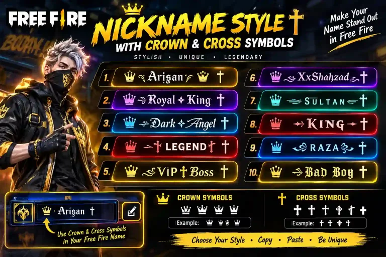
Think of it in three parts: the base font carries the identity, a single symbol adds the accent, and spacing ties it together cleanly. A crown before a name reads as confident. A small flame at the end reads as aggressive. One well-placed symbol does more work than four random ones a name with a single symbol still reads clean at a glance, while a name stacked with crowns, wings, and stars turns into a blur the instant the kill feed scrolls.
If you also want country- or community-specific styles for example, stylish Sikh and Punjabi names for Free Fire that collection is a solid reference for names that stay both readable and meaningful.
Where to Find Ready-Made Symbols
Rather than hunting through random Unicode charts, it’s faster to pull from a tested symbol set that’s already checked against how Free Fire’s client renders characters. Sticking to a tested set lowers the risk of pasting a glyph that shows up as a blank box on someone else’s phone.
Common Mistakes That Ruin an Otherwise Good Name
Chasing rare Unicode blocks. Not every symbol renders in Free Fire’s client. If a name uses an obscure glyph, it can appear as a blank box for other players even if it looks fine on your own screen.
Over-decorating. A name with a crown, wings, and underline on every letter stops being a name and starts being noise. One or two decorative elements is the practical ceiling.
Ignoring the profanity and character filters. Free Fire blocks certain symbols and full-width character sets outright, especially ones that resemble official tags. If a name gets rejected, swap the specific glyph causing the issue rather than adding more symbols on top.
Never testing in an actual match. A style can look sharp in a generator preview at 40 pixels and completely blur out in a real kill feed rendered under 14 pixels tall on a phone screen. Always test before you commit.
How to Build Your Name Step by Step
- Start with a short base name. Three to six letters gives you room to add a symbol without the name becoming cluttered.
- Pick one font category. Decide if you want bold, sans-serif, script, or decorative based on your playstyle not just whichever looks flashiest in the preview.
- Add a single symbol, if any. A crown, star, or small icon at the start or end is usually enough.
- Preview at small size. Shrink the preview or view it from a distance to simulate how it’ll look in a fast-scrolling kill feed.
- Test in a custom room. Confirm it renders properly, especially if friends are on different phone models.
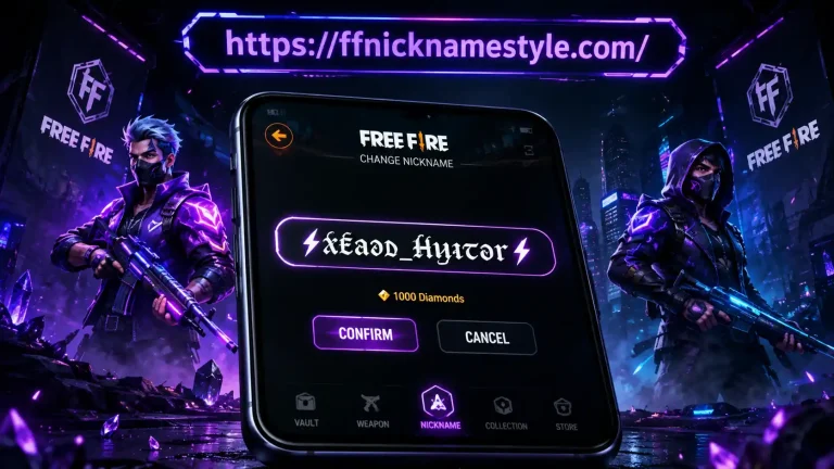
- Copy and paste directly into the name field, keeping an eye on Free Fire’s character limit.
Keep two or three finished styles saved somewhere so you can switch instantly if a name ever gets flagged or you just want a change.
Font Styles Beyond Your Main Name
Once your main name is locked in, the same rules apply anywhere else Free Fire shows text bio lines, guild tags, and signature lines all render through the same fixed system font, so the same Unicode substitution trick works everywhere. A guild tag with a heavy gothic style can clash with a clean sans-serif player name, so it’s worth keeping one style family across your whole profile rather than mixing three different looks.
Frequently Asked Questions
What’s the best font style for a Free Fire name?
Clean sans-serif or bold styles tend to work best because they stay legible in a fast kill feed. Thin script fonts look elegant in a preview but often blur out during actual gameplay.
Do font styles change how the game itself displays my name?
No Free Fire’s interface always uses the same system font. A “font style” is really a different set of Unicode characters standing in for normal letters, which is why some render differently across devices.
Why does my name look fine in the generator but broken in-game?
This almost always comes down to the device rendering the name. Older phones and some budget Android devices don’t support every Unicode block, so rare symbols can show up as blank boxes. Stick to widely supported characters and always test in a custom room first.
How many symbols should I use in one name?
One is usually enough, two at most. Beyond that, a name stops reading as a name and starts reading as clutter especially once it’s moving in a kill feed rather than sitting still in a preview.
Can I use themed or cultural name styles?
Yes plenty of players build names around a specific cultural or community identity, matched to the same readability rules covered above.